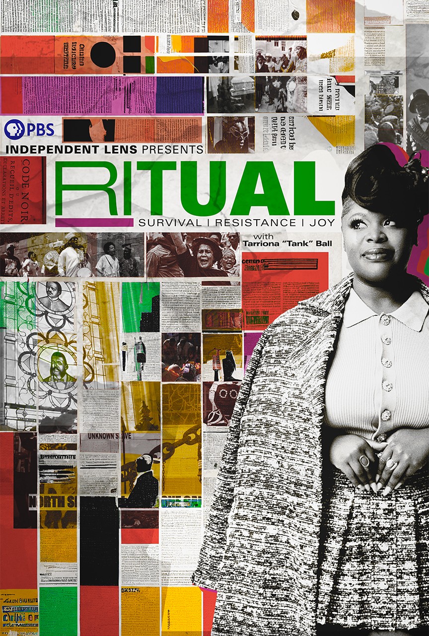
The Making Of
|
|
Filmmaker Gary Hustwit reflects on what makes good design, the people behind the fonts and why typography fans should forget standup and keep their day jobs.
What led you to make this film?
I’ve always been a huge fan of graphic design. I bought a Macintosh computer in the late 1980s and I’ve been playing around with fonts ever since. I think there are some amazingly talented designers out there, people whose work we see every day, but maybe take for granted. Fonts aren’t magically generated by your computer; people actually draw these things, so I wanted to talk to these designers about what they do and look at how their work affects our lives.
What were some of the challenges you faced in making this film?
As with all independent documentaries, fundraising is the biggest challenge. For this film, I used the “traditional” fundraising structure: I maxed out every credit card I had, my girlfriend’s credit cards, friends, family, etc. And we sold t-shirts and posters on our Web site while we were still shooting the film.
![]() ![]() ![]() ![]() ![]()
|
How do you see the next 50 years of graphic design differing from the last 50?
Prior to the Internet, trends in graphic design were more regional and those trends took years or decades to spread between different countries and cultures. In 1957, if you wanted to use Helvetica, you had to arrange for literally tons of metal type to be shipped from the foundry in Switzerland to your printing shop. Today, design trends rise and fall worldwide in a few days with the click of a mouse. So I don’t think we’ll see specific graphic design styles dominating in the next 50 years; the dominant style is now a mix of every style, all at once.
Do you think there's a chance of a newly designed font ever gaining widespread prominence or will Helvetica rule forever?
Well, it’s got a 50-year head start, so it’s a challenge for sure. It really depends on technological factors; if Microsoft decides to put a new font on hundreds of millions of Windows machines, then that’s a dominant font. But people always seem to come back to Helvetica—there’s a strange familiarity and character in its letters that somehow make us want to keep reading and using it.
Can you put definitions on what makes good or bad design?
For me, good design is simple, clear, useful, sustainable and it makes my life better. Bad design is wasteful, confusing and redundant.
What are your favorite resources for exploring great modern-day design and designers?
There are a few Web sites that do a great job of covering the design world: Design Observer and Core77 are daily reads for me.
How did you gain the trust of the subjects in your film?
I think most of them thought I was kidding at first! But once I explained what I was trying to do with the film, they all got very excited about participating. Most of these designers had never done a filmed interview before, so I think they were thrilled that someone wanted to them to talk about what they do.
Tell us about a scene in the film that especially moved or resonated with you.
While we were driving around the streets of Berlin, shooting the street scenes there, we came upon a worker finishing up the installation of a huge billboard for the World Cup. It was a full block long, it featured 10-foot high Helvetica lettering and he was just finishing the last panel of it. I think that’s probably my favorite shot in the film, just because the type is so large, there’s someone directly interacting with it and because we found it by accident.
What has the audience response been so far?
The audience response worldwide has been pretty amazing. The film has screened in about 300 cities, everywhere from Moscow to Melbourne and from Tehran to Tokyo. In one sense, it’s the first major documentary about graphic design, so you’ve got everyone from veteran designers who’ve been doing this for decades to young design students all coming out to see a film about what they love. The screenings were social events for designers in the various cities. And, since so many non-designers use fonts these days, the film crossed over to non-designers as well, to anyone who’s interested in art or communication.
The independent film business is a difficult one. What keeps you motivated?
What motivates me is getting to see films on screen that started out as just a crazy idea in my head. I really approach filmmaking more as a viewer: what film would I most want to see, but that doesn’t exist yet? So it’s cool to see that film come to life and then be able to share it with other people.
Why did you choose to present your film on public television?
I think most filmmakers want to reach the largest audience possible and one that’s most suited to their subject matter. The public television audience is constantly curious about the world around us, and I think that’s really the message of this film: to be aware of your surroundings and to not take seemingly ubiquitous things like typography for granted.
Is there anything else you’d like to share in this Q&A?
People usually ask, “What’s your next film about, Times New Roman?” Then they laugh a lot, thinking they’re the first one to come up with that joke. Trust me, they’re not!
Read the Filmmaker Statement >>
Learn more about the filmmaker >>
|
|
|


