|

|

|
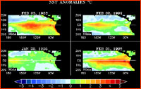
The Quiet Revolution Mapping El Niño by Mark Hoover How fast do your eyes glaze over when you read something like this? "El Niño can be recognized by its heat signature in the equatorial
But even a five-year old can point to El Niño in this picture; just tell her to look for the red. A quiet revolution has transformed the study of weather, and many other fields as well. Until the last decade or two, scientists used to pass data around more in tables and lists, and less in pictures. Part of the reason much of science and mathematics has seemed foreboding to lay persons is that it takes practice and specialization to be able to turn words and symbols into pictures, and to then use these mental images to grasp the meaning behind the figures and the technical language. But digital technology is changing that, and fast, by allowing us to collect huge amounts of information in visual form, and to move that data around very quickly. Picture-based information helps us all be a little more like Einstein, who used visualization as a scalpel to dissect meaning in a geometric way. Einstein 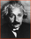 almost flunked math as a student; his gift was the ability to
make a mental movie of the world, and play it in his head
while he looked intensely at things other people overlooked.
Einstein didn't discover relativity with a paper and pencil;
he discovered it by closing his eyes and seeing. He called
these visions gedanken, or "thought experiments."
almost flunked math as a student; his gift was the ability to
make a mental movie of the world, and play it in his head
while he looked intensely at things other people overlooked.
Einstein didn't discover relativity with a paper and pencil;
he discovered it by closing his eyes and seeing. He called
these visions gedanken, or "thought experiments."Although our language separates us from other animals, the brain circuitry that creates words and lets us extract meaning from them is relatively new, having arisen only in the last few million years, or perhaps even more recently. In contrast, the circuitry that handles visualization is ancient, with origins hundreds of millions of years in the past. Seeing is a far more powerful way of grasping meaning than listening to or reading descriptive words, simply because we've been doing it for so long. It's our nature. Unlike words, pictures can be grasped as a whole (psychologists speak of this as "gestalt"), and patterns can be recognized instantly. Many scientists talk  about seeing a pattern "rise up" out of a picture. Face
recognition is a good example of the brain's visual circuits
in action. Even the best police sketch artists must spend
hours with witnesses trying to convert words back into a
visual image of a suspect. There is a gulf between the verbal
and visual realms.
about seeing a pattern "rise up" out of a picture. Face
recognition is a good example of the brain's visual circuits
in action. Even the best police sketch artists must spend
hours with witnesses trying to convert words back into a
visual image of a suspect. There is a gulf between the verbal
and visual realms.To understand El Niño requires finding its patterns, and for that there's nothing better than a map. For an example of how fast science is
Imagine trying to do what Gilbert Walker did in the early part of this century, when he was looking for the patterns that underlie El Niño. He collected a stockpile of written weather records from a number of locations
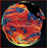
Now imagine what Walker could have done with some images, like these multi-band comparisons, instead of all those tables of measurements and numbers. He'd have wrapped things up faster than you can say "Nintendo." Here are some more weather patterns that are easy to see, but would be tedious and clumsy to convey in words. Global wind patterns are particularly difficult to describe verbally, but easy to grasp here in a NASA map drawn from satellite wind measurements. The idea of a perpetual march of cyclones from west to east across the Temperate Zone is rather tough to describe if you're not in the weather business, although we tried in Global Weather Machine. But it is immediately apparent if you watch this animated combination of radar images
The days of scientists gathering weather information in the field with single instruments, and oceanographers sailing off on a ship for a month of taking readings, have been superceded by satellites and grids of sensors, like the TOGA/TAO buoy array, linked by satellites and networks. A single ocean color
By mapping El Niño, and using computers to sift out the background noise and enhance the foreground patterns, it's possible to begin acquiring a visual understanding of how El Niño works, and how it changes weather around the world. Photos/Images: (1,6-7) NASA; (2) AIP Niels Bohr Library; (4) NOAA; (5) JPL/NASA. Anatomy of El Niño | Chasing El Niño | El Niño's Reach Dispatches | Resources | Mail | Site Map | El Niño Home Editor's Picks | Previous Sites | Join Us/E-mail | TV/Web Schedule About NOVA | Teachers | Site Map | Shop | Jobs | Search | To print PBS Online | NOVA Online | WGBH © | Updated November 2000 |
||||||||||||||||||||