Painting with Wilson Bickford
Wilson Bickford "Let's Go Fly a Kite" Part 1
Season 4 Episode 10 | 25m 40sVideo has Closed Captions
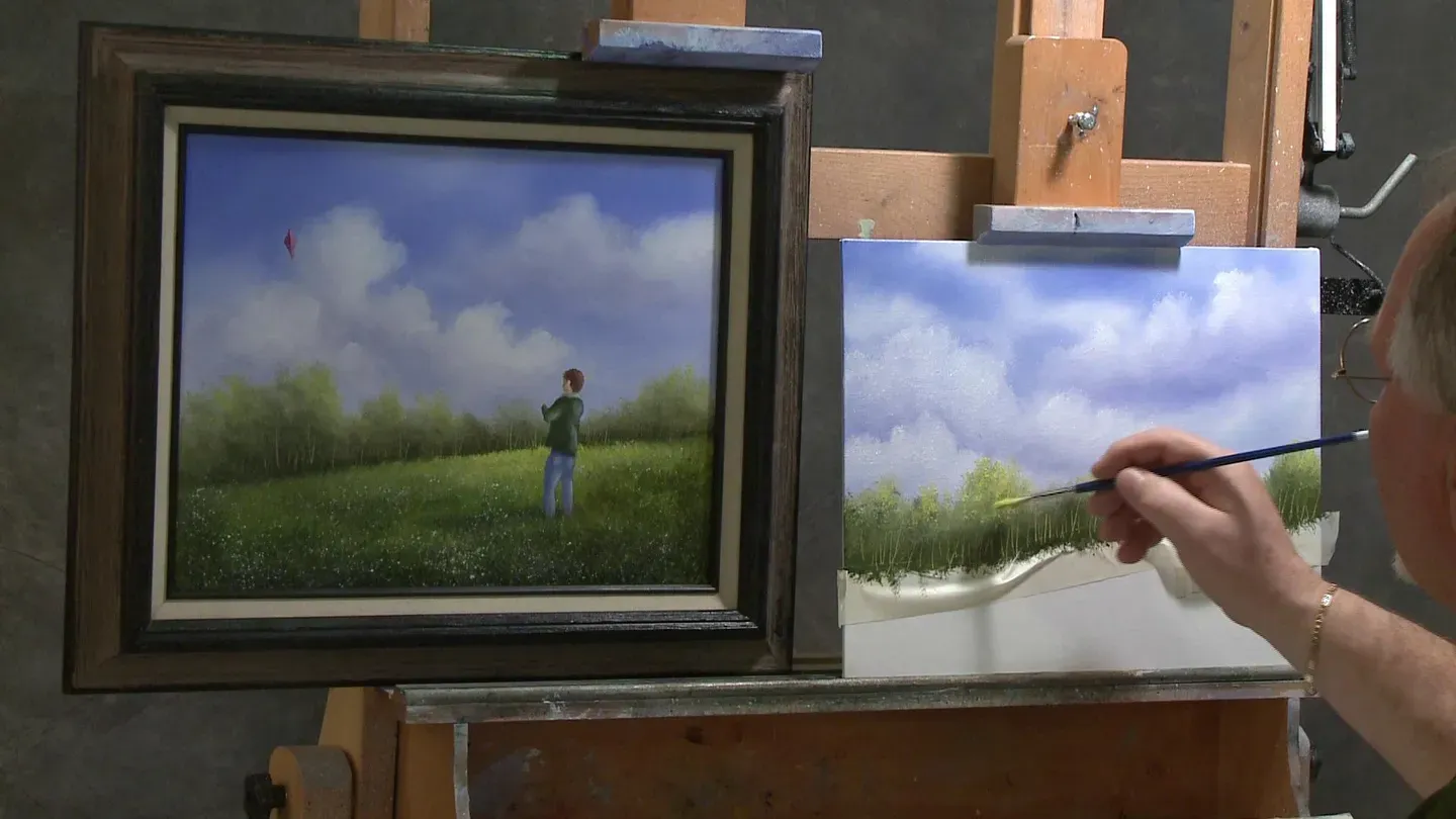
Wilson shows how to personalize a child flying a kite in a meadow full of flowers.
It’s June, and the meadow is full of flowers of nearly every color. It’s a perfect day to fly a kite! Wilson shows how to personalize the child flying the kite to look like the artist’s child or grandchild through use of hair color, skin tone, and clothing.
Problems playing video? | Closed Captioning Feedback
Problems playing video? | Closed Captioning Feedback
Painting with Wilson Bickford is a local public television program presented by WPBS
Sponsored by: St. Lawrence County &nbps; &nbps; The Daylight Company &nbps; &nbps; J.M. McDonald Foundation
Painting with Wilson Bickford
Wilson Bickford "Let's Go Fly a Kite" Part 1
Season 4 Episode 10 | 25m 40sVideo has Closed Captions
It’s June, and the meadow is full of flowers of nearly every color. It’s a perfect day to fly a kite! Wilson shows how to personalize the child flying the kite to look like the artist’s child or grandchild through use of hair color, skin tone, and clothing.
Problems playing video? | Closed Captioning Feedback
Where to Watch Painting with Wilson Bickford
Painting with Wilson Bickford is available to stream on pbs.org and the PBS app.
Wilson Bickford: Join me next on Painting with Wilson Bickford, and we'll "Go Fly a Kite."
♪ Let's go fly a kite ♪ ♪ up to the highest height.
Oh, let's go fly a kite.
♪ [MUSIC] [MUSIC] Hi, thanks for joining me today.
It's a little breezy out, so I thought maybe we'd go fly a kite today.
This is one of my projects that I teach in my classes I've done over the years.
This is a variation I've done, different themes of it.
This is a simple variation.
We're going to break this into two classes, two episodes today, because I feel there's enough in this that I need to break it down to really instruct it and teach it to you.
This will be a two part lesson.
We're going to start out with the first lesson today.
If you go to the WPBS-TV website, you'll be able to download a supply list and a sketch that you can transfer.
Now, if you feel you don't want to use my sketch, you wouldn't have to.
You can come up with your own design, whatever.
I just want to show you the techniques involved.
What I did, is I take the sketch, and I place it on the canvas.
It tells about the placement right here.
I lay the sketch over the canvas.
I use graphite transfer paper underneath the paper to transfer the design.
I like to use a red ped on the sketch because it makes the black lines show up a little easier, you can track your progress.
The image goes onto the canvas and is drawn on there.
After I've done that, I take masking tape, just regular masking tape right from the hardware store.
It's nothing special.
People always me, "What special tape do you use?"
This is not special tape.
It's just stuff I get at the local hardware store.
I put a strip of tape over the little boy.
I take a sharp X-ACTO craft knife, utility knife.
I trim away everything that's not the boy.
I've already started some of this just so I didn't have to spend time on the film here doing it.
I've trimmed around that.
You'll see that if you trim carefully, the little boy stays covered up, which has brought me to this point.
Now, I'm using panels here.
These are canvas panels.
I do these type of paintings with the taping out and the masking and the cutting on stretched canvas, so you just got to be very careful on a stretched canvas obviously.
You want to use a brand new blade, a very sharp blade, and a very light touch.
You can trim just through the tape without actually cutting through your canvas.
You just need to use a light touch and a brand new blade.
A dull blade will get you into trouble.
Our shop teacher in school always told us, "Boys, use a sharp tool.
A dull tool is much more dangerous."
That is true.
Okay, from here, I've got this set up like this.
I'm going to find my horizon line back through there.
It's going to intersect through his body a little bit like this.
Now see, there's a little prep involved in this one.
But I like to bring you projects with other subjects, and not just plain landscapes.
I can do just plain landscapes, but I also like to incorporate something in my paintings just to show you.
I'm going to have the horizon line back there.
[tape ripping] For the time being, I'm going to put a piece of tape on there.
You'll see why.
It just makes my life a little easier.
I don't have to be so exact with it.
I'm just going to bend ...
I could put it on and trim it, cut it with that knife.
I don't really need to, but you'll see that I kink it and twist it and torque it.
I can make it kind of conform to that line.
That way, it keeps me from getting the lighter colors down where I want the grass.
I want this area dry.
I'm not going to use any base coat down there today.
I want this to stay dry.
I'm going to tab this over on the ends where I can easily get to it to remove it when the time comes.
The prep work is done.
We can get on with this.
For the brushes I'm using today, I'm using a 2" scenery brush, 1-1/2" large texture brush, a number three fan brush, a number two detail script liner, a number two liner, and a mop brush.
For my oil colors, I'm using ultramarine blue, sap green, cadmium yellow pale, burnt sienna, red rose deep, titanium white.
I have some white base coat medium here.
With the 2" brush, I'm going to put a thin coat of white on this background to get it started.
You want to scrub it in very, very thinly.
A lot of people make the mistake of putting it on heavy like this and literally painting.
I'm not painting.
I'm appling a base coat.
There's a big difference there.
I'm going to scrub this in very, very thinly.
The reason for the base coat is it makes the background wet and slick, very blendable, so I get soft edges throughout my sky where I want them.
Relatively speaking, there's going to be much softer edges in that background sky, and the edges get harder in the foliage and the grass and the boy as we come forward.
Soft edges appear to recede.
Hard edges will come forward.
That's one of the little tricks we use to show depth on a flat canvas like this.
We're just trying to show that third dimension we don't have.
Okay, you want to scrub it in very thinly like that.
If you feel you have too much, you can simply take a paper tower or a rag and wipe some of that off.
Okay, I'm going to start in with the sky color.
I'm going to take some of this ultramarine blue right into the dirty brush that's got the white left in it.
Work it in evenly so there's no chunks or streaks on your brush, and you have a uniform color.
I'm going a little darker here than I ultimately want it because as I apply it, it will pick up some of that white base coat.
I'm not going to paint it solid.
I'm going to paint it with blotches in it, even though I'm going to put clouds in it.
You'll see that I roll, scrub, twist and turn the brush.
I'm leaving some pockets of white behind.
As I come lower, I'm going to use a lighter touch.
Three things are happening here.
I'm losing blue off the blue, I'm picking up more of the white base coat as I work downward, and I'm lightening the touch, the pressure on the brush.
You'll see that it gets lighter and lighter and lighter as it fades down behind those trees.
That's what we want.
That is aerial perspective.
The sky is usually lighter off on the horizon, and much darker overhead.
See, I've graded it here from dark blue getting continuously a little lighter.
That on itself right there, once I blend it, would make a nice sky.
We are going to come back and embellish it and put some clouds in there just for the sake of the lesson.
People always struggle with clouds, so I want to show you that.
I'm going to really wipe this brush off.
I don't need to wash it.
If I lay the brush flush and flat, and just do a circular stroke, circles or ovals, and just kind of dust over the whole thing.
I look at anything that looks like a hard brush mark ... See, right here where it looks very coarse and brush marks.
See, if I dance across that see how it softens it out?
It's because of the white base coat.
You're going to pick up paint as you go, so you want to keep wiping your brush off because if there's paint on your brush, you're going to be painting.
You're just stretching more paint around.
I want to be blending at this point.
See that, in itself, would make a nice sky.
If you're happy with that, you could actually leave it.
For the next five minutes while I put the clouds in, you can go have a glass of iced tea.
Take a break from me.
I am going to put some clouds in here.
I'm going to use my fan brush.
I'm going to start with a titanium white.
I can use some of this blue I've already got here.
White, ultramarine blue, a little touch of red.
You'll notice in the sample, there's kind of a purple-y gray color in there for the shadows within the clouds.
I'm going to mix up a value.
It needs to be a little darker than my sky.
I won't know until I literally get this up here.
I'd like that just a tad darker.
This is like making soup.
Every now and then if you're making soup, you have to dip the ladle in and taste it and see what you got.
I need a little more spice in this.
There we go.
That's a better value.
That'll show up a little easier.
I'm going to base in the shadowed parts of the clouds.
This part that you see here is not what you're going to end up seeing with the shadow tone because I'll put that on top.
I'm putting the cloud in basically where I want it, but this will get bigger as I put the highlight on top.
See, this one's a little darker than this one, so actually it's going to show up better for you, which is good.
See, what I'm saying is if I put this in like that, that's not the cloud you're going to see.
I'm going to come in on the top bigger and more billowy.
It looks kind of odd.
I can kind of see it in my mind's eye because I have an idea slightly of where I'm going to go with it.
Another thing is ...
I'm going to point this out now ... it's kind of hard to tell, but there's a little bit of a scratch through there for that string on that kite.
It's going to be white canvas that shows through there eventually.
I want to get a dark enough purple in there to where that's going to kind of show up to a certain degree somewhere in the future here when I put that string on there.
If I have just a bunch of white clouds, it's not going to show as well.
I brought these down right behind the treeline a little bit.
See, I'm just scrubbing paint off the brush.
I don't have to too low because my trees will overlap some of this.
I'm going to wipe that brush off.
I like to soften the bottom edges.
If you soften the bottom edge of your cloud, it makes look like it recedes and rolls under, just like it would.
You don't want to leave a hard edge there.
See, if I soften that out.
Again, we're worried about hard edges and soft edges.
Soft edges make things look more round and far away.
There we go.
Okay, I do have to stop and wash this brush out.
I have odorless mineral spirits here in this pail.
I'm just rinsing that out, get all the gook out of it.
If you're the type that's sensitive to paint thinners, leave the lid on it.
A lot of people are up in arms about the safety of using thinners and whatnot.
Just use some common sense when you're working in your studio.
Keep it covered up.
You'll see that I don't do excessive brush washing every five minutes.
I don't need to.
A lot of times I can just wipe the brush and keep going.
I only have just one brush washing session at the end of the painting.
I'm going to take some titanium white and I'm going to put a little bit of that white base coat with it, just to thin it a little bit so it sticks a little easier to my canvas.
Quite a bit of paint on the brush.
I'm going to come in, and I use the corner of the brush, and I kind of pull inward and down.
See, now I am thinking in my mind's eye the shape of that cloud.
I'm creating that shape.
It looks pretty awful here now, but we got to do some more tweaking on it.
Everybody gets really antsy, wants to do everything all at once.
Sometimes you got to put it on there and then come back and fidget with it.
I'm wiping the brush off because I'm picking up a lot of that purple.
I have to keep my white pure.
I keep wiping it off.
Oh, probably the boy's kite's going to go right about there.
See, I'm planning out a little bit in my mind's eye where stuff is going to fall.
Composition is a major, major part of a painting.
A lot of people can do the techniques and paint clouds and hills and grass, but their composition kind of lacks because they skipped over that step.
They want to get right to the painting part.
Composition is very important.
Just means how you lay things out on your canvas.
I'm a stickler for the rule of thirds.
If you look that up online, you'll find it.
That's a very common art principle.
A lot of artists use it.
A lot of artists don't.
I'm a very staunch believer in that.
The rule of thirds just says that things that things should fall on third lines, not dead center or in the middle, or very tight to the edge.
You'll notice the boy's kind of a third of the way in from this side.
The kite is roughly about a third of the way in from that side.
It makes a pleasing flow for the viewer.
Okay, I'm going to fade the bottom of this white in a little bit with the purple.
You want those to kind of roll together.
I'm going to do my preliminary blending with this fan brush.
Then I'm going to come in my mop.
Cleaning up at the end of the night, I'm going to clean up with the mop.
Okay.
I bring up my mop brush into play here.
He's been setting on the bench over there waiting to get into the game.
This is a very soft brush, almost like a makeup brush.
I'm going to take a rag and have it handy because I'll need to wipe this off as I go.
I'm going to use a light touch with this.
See how it's really grainy and coarse with the fan brush?
This will soften all those little scratches and stuff out.
Also, softens the line on the edge so it's not quite so rigid.
Just doing little circles with my fingers and wrist.
Just enough to kind of take that coarseness out.
See how that softens it out and makes it look very cloud-like and it pushes it back because it's softening the edges?
Some of those little white pockets I left behind still read through there.
It looks like clouds and openings in the sky farther away, which is all good.
That's a pretty good looking sky, I think.
Now, at this point, I usually stop and I analyze it.
If I think it needs a little extra punch, I give it a little extra punch.
I'm going to wash this brush out again because as I'm scrubbing those clouds in, I'm continuously picking up that purple from the clouds and the blue sky behind it.
I'm going to take a little more white.
See, my white here was getting kind of dirty from the contaminated brush going in there.
I'm going to start fresh with more pure white.
A couple spots here, especially in towards the center of the canvas.
Notice how this is a little bit brighter in through here.
Just to give it a little extra snap.
This is not a mistake.
It's nothing I did wrong the first time around.
It's an adjustment.
I'm just trying to make it a little better.
You want to always analyze your painting as you go, and just see if everything's holding up or not.
A little chunk of something right there.
I'll just whisk that off.
Now, once I put this on, I need to come back and just soften it with the mop.
See how that gives it a little extra brightness?
Yours will be different when you do it.
Just realize that you can always go back and make that adjustment.
Let me come in with the mop now and just kind of soften that out.
Don't overdo it.
The more I blend it, the more purple it's picking up underneath so you just want to do it enough to get the job done, get the coarseness out of it, and then get back out of there.
Okay, got a brush bristle right there broken off.
They say it's not really an oil painting unless you see the bristles in it.
I guess this one's really an oil painting.
Oil brushes take a lot of abuse.
Watercolor artists, they're working very wet and usually a softer touch.
Oil painters are dabbing and scrubbing.
That's why the bristles break off.
It's not the sign of a bad brush.
It a sign that you're doing it correctly.
All right.
[MUSIC] When you do your version of this painting, don't be afraid to change the time of year.
By using the same exact colors that I have on my pallette, I simply used more of the burnt sienna and yellow tones to create an autumn feel.
Give it a try.
All right, I think that's going to wrap it for the sky.
I'm going to start on these background trees.
I'm going to use the fan brush for that as well.
I'm going to rinse it out here really quickly.
We got white in it.
I want to base the trees in with a darker tone, shadowy tone.
I'm going to add a highlight.
For the darker tone, I can mix right into this color here.
I'm kind of done with that purple.
You'll see that I often build one color off the previous one.
It saves room on my pallette.
I'm done with that color, and it's not going to hurt anything.
I'm going to take blue.
This is ultramarine blue and sap green, and maybe a little bit of the burnt sienna.
You know that old song don't you?
Burnt sienna, don't you cry for me.
All right.
Now, this is dark and what I'm looking at is this dark tone here.
I'm going to actually make it even a little darker than that one.
Just so you can really see it.
I'm going to come right down to my tape line.. My tape line represents that land line right there with the grass.
If I make this a little darker, it's easier for you to perceive and to see it.
Basically, I just want some roughness here, texture.
I'm not thinking trees yet.
I'm just trying to get that nice and solid right down to my tape, that yellow tape.
I'm painting right over the boy.
I can see him in there.
You might not be able to see him quite as easily on screen, but I can see where he is.
I'm going to kind of bring the foliage down so his head is exposed against the sky and not have the greenery behind it, which will make him stand out easier.
Okay, once I get that based in, now I'm going to start thinking about trees.
I'm going to open up the corner of the brush like this and use more of the corner.
If I come up and just lightly ...
I'm kind of turning the brush as I do it.
I'm thinking rounded tree shapes of some sort.
It's just like the clouds.
I based in the shadow.
It's not what you saw for the final image because I put light on the top.
We're going to put light yellow green.
Even that spot right there is not what you're going to see, so don't be too overly concerned.
You just want to think about the flow, have some ups and downs, some height variations.
Because we're going to highlight that and it will change that profile on the top.
See, I want this to sneak down behind the boy here a little bit, so I'm being careful there that I don't get too high.
We used to sing a song when I was in grade school.
That was a couple years ago so I don't remember all the words, but it was called, "Let's Go Fly a Kite."
We did it for our spring concert one time.
All I remember is ♪ up in the ♪ ♪ atmosphere, off where the air is clear, come let's go fly ♪ ♪ a kite,♪ or something like that.
Okay, now, say I'm looking at the flow, trying to get something that's kind of pleasing to the eye.
This one, I have the high spots over here.
This one, I'm going to put them here.
That's all good.
I'm just painting what I feel right now.
I think I want one a little higher right there.
It's fine, as long as it looks natural, that's all we care.
I'm going to use the brush handle.
If I just pull up, I'm pulling right off the yellow tape, from the yellow tape upward.
I can put the indication there's some little trunks in there.
They are lighter, so maybe we got some birch trees in there, silhouetted against this background.
You are going to pick up quite a glob on paint on the tip as you do that, so you want to wipe it off.
I usually put a few more than I want just because I know that I'm going to lose some of them when I put the highlights on.
Let them lean to and fro like trees.
Don't put them all straight like teeth on a comb.
Let them wibble wobble a little bit.
Okay, that's coming along pretty nicely, don't you think?
Don't you think you can do this?
I have every bit of faith in you.
I know you can.
Okay, I'm going to take the fan brush and wash it out.
Dry it off.
I'm going to come in with my highlight color, which is going to be comprised of white, cadmium yellow pale and a little bit of the straight sap green, not the stuff that I muddied down with the blue and the sienna.
I want something kind of more vibrant, lighter, yellowy green.
Again, I'm not sure until I get it up here on the canvas.
I'm going to put just a little touch of the white base coat with that too.
Open the brush up, quite a bit of texture.
I was just about to say, I won't know for sure until I get it up here and see how it reads against that.
It might not be light enough.
I have to check the value.
It's showing, but I wish it showed a little nicer, so I'm going to add more white and yellow to that.
That's one of those adjustments you'll have to make as being an artist because every painting that you're going to do is going to require that.
There we go.
That's better.
See, I just randomly kind of take the corner of the brush and hitting the tops of the trees.
The lightness painting's coming from behind the boy.
You can see the cast shadow.
If you think of it and kind of highlight more towards the right side of some of these than not, it'll make sense.
Typically, I start at the top of tree.
As I work my way down, I just use a lighter touch and let it fade back into the dark.
Once it comes back dark, I can create another lower shrub.
I don't have any in here, but I'll show you how to do it.
We have just enough time here to show you that, which is good.
See, I'm able to slow down in a two-parter like this, so that's good.
I love to teach, so I want to teach you the right way rather than just wiz-bang through this and have you guessing, "How did he really do that?"
Okay.
See, I'm just softening that down in so that foliage is coming to life.
Now, right down here, just above my tape edge right there, if I wanted to create some lower lying shrubs or bushes ...
I don't have it on this one, like I said, but I can create it just by putting something a little lighter here and there.
I don't want to do it throughout, but you'll see that these look like they're lower lying sections of foliage, either bushes or shrubs, whatever you want to call them, shorter trees.
You'll see that it gives you a layered effect.
Okay, we're getting down to the wire here, but I've got this exactly where I wanted to be.
When we come back next time, we're going to finish this up.
See, that tape gives us a nice edge to pick up on where we leave off.
I'm so glad you tuned in for this episode.
Don't miss the next one.
We'll finish this up and we'll go fly a kite.
Until then, stay creative and keep painting.
ANNOUNCER: All 13 episodes of Painting With Wilson Bickford, Series #4 are now available on DVD or blu-ray in one boxed set for $35 plus $4.95 shipping and handling.
Or learn the techniques used to paint "Evening Choir Practice" or "Majestic Mountain" with the in-depth Wilson Bickford "Paint Smart Not Hard" series instructional DVDs.
Order online or watch or download directly to your computer or mobile device.
More information at wpbstv.org/painting.
[MUSIC] [MUSIC] [MUSIC]


- Home and How To

Hit the road in a classic car for a tour through Great Britain with two antiques experts.
 New Season


 New Episode
 New Episode


Support for PBS provided by:
Painting with Wilson Bickford is a local public television program presented by WPBS
Sponsored by: St. Lawrence County &nbps; &nbps; The Daylight Company &nbps; &nbps; J.M. McDonald Foundation